Data Analysis Projects
Spotify songs to Youtube playlist reach
I wanted to put myself in the perspective of a Spotify exec, asking a data analysts to see “Has the number of Spotify-released songs that achieve high YouTube playlist distribution increased across release cohorts?”
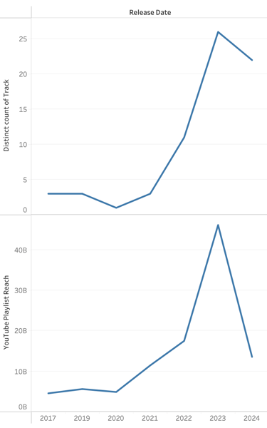
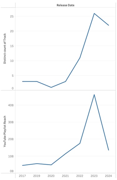
The trend here is interesting. The sum of Playlist views through YouTube is considerably lower in 2024, comparable to that of 2021. This is not very alarming, as these reaches build up over time and continue to grow past the year-to-date. What is important to see is that the cross-platform amplification is strengthening, not only in total reach, but more breakout singles. Audience spillover is improving over the years and at a rapid pace. What do we do with this information? We double down. Double down on coordinated release strategy. Push for marketing to align across platforms, especially between Spotify and YouTube.
Power of Story-led engagements
This project came from my internships at Sky Story Studios. I was tasked with scraping TED Talk datasets and identifying key storytelling metrics to assess their effect on engagement. I filtered through 2300+ Ted Talks to find the ratio for their emotional responsiveness. The goal is to see how these story led engagements left the audience with a more inspired outlook. If leading with a story makes a talk more inspiring to others, there should be a greater trend amongst story-led frameworks compared to those that are not.
I utilized Python and Claude to create a Composite story score that includes a ratio of keyword hits within the transcript, such as "I remember" or "Back in...", and mixed it with a score for keywords using first-person identity, such as "I", "me", "my", etc. With this information, we also found a certain percentage of those keywords in the opening section of each talk. When the ratio reached above a certain percentile(60%), a TED Talk was considered story-led. Anything below was non-story-led. I was able to filter for the ratio of votes "inspiring, " persuasive," "Courageous," and "Beautiful" over the total number of votes via SQL. Table 1 shows us that these story-led speaking engagements are statistically significant, and have a greater ratio of votes for "Inspiring".
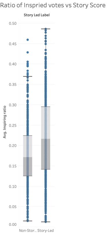
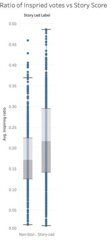
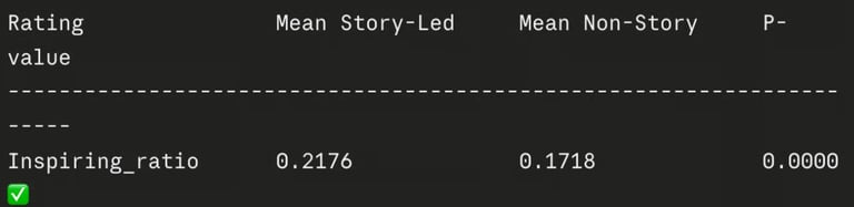
Table 2
Table 1
What make of Toyota has the greatest value for its miles upon auction?
I always assumed Toyotas held their value well based upon their reliability standards. However, I wanted to see what body(type) of Toyota retains their value the most as they rack up miles, to make a better informed decisions on purchasing one in the future.
To do this, I utilized SQL to group by all body types of Toyotas in a car sales dataset of over 26,000 data points. I filtered out body types that had at least 50 individual entries, to ensure they were statistically significant. I averaged out the odometer counter and selling price per body type and used Pandas within Python to create a price-per-mile ratio of the average selling price to the average odometer of the body types made within SQL. MatPlotLib visualized these results.
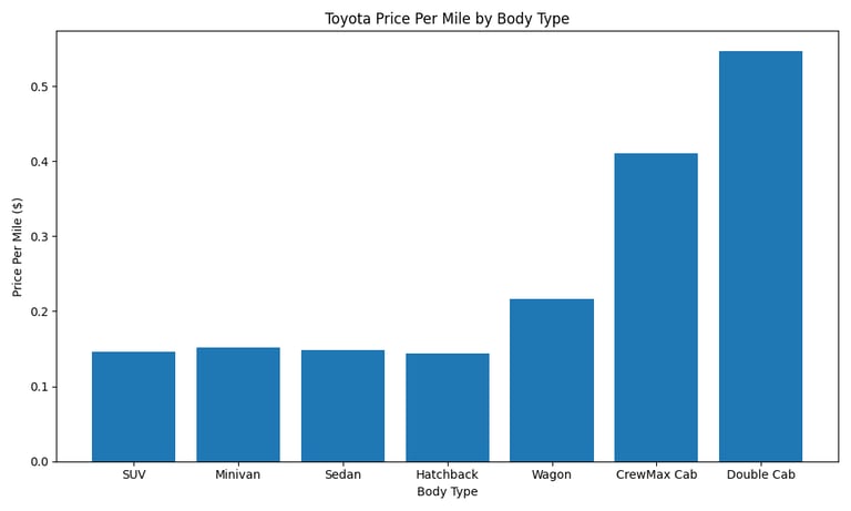
My findings saw a huge jump in the Price per Mile for the CrewMax Cab(~$0.41) and an even bigger jump for the Double Cab(~$0.55), which both refer to the Toyota Pickup body. SUVs, Minivans, Sedans, and Hatchbacks all sit about equal around ~$0.15 per mile. Based upon the averages, the Toyota Pickup body holds a greater price per mile, which adversely insists that the value over time decreases at a slower rate than other body's made by Toyota.
Table 2 visualizes the inspired voters compared to the mean story-led scores in a box plot format. On average, a story-led speaking engagement, across all topics, led people to feel more inspired and emotionally provoked. Furthermore, each quartile for story-led speaking engagements resulted in a greater ratio. I presented this finding to my boss as a potential data point to incorporate into the website to strengthen the brand positioning about leading with a story. Based on 3000+ Ted Talks, story-leading frameworks led audiences to feel more inspired across the board!

Contact
Reach out to connect or discuss projects.